Once In A Jiao
An online semi-anonymous music sharing platform for people with social anxiety, allowing them to express themselves.
#MobileUX/UI #Branding #Research

Introduction
The Cheung Chau Da Jiao Festival is a historic festival where a deity is paraded
to drive away evil spirits. This tradition originated in the 18th century when the island was plagued by disease and pirates. However, current promotion has caused people over focusing on Ping On Bun to forget the true meaning of the festival.
To bring back the original meaning, we aim to rebrand the festival’s identity, emphasizing other activities and making the brand appear more youthful to attract the new generation’s interest in learning about the festival.
Research
With the study on the festival promotion, Ping On Pun become as an icon for the Cheung Chau Da Jiao Festival, which makes people and the foreign traveller not really know others activities that happen in this festival. For example, Taoist ritual and Flying Colors Parade.
Moreover, the identity in the festival are not consistent and youth. But I found out that the color using on the ritual and flower boards and pretty sharp and light which is the color that the youth like. Therefore, I decided to use these color to make as the identity to fit the youth aesthetics also fits the identity of this traditional festival.
Design development
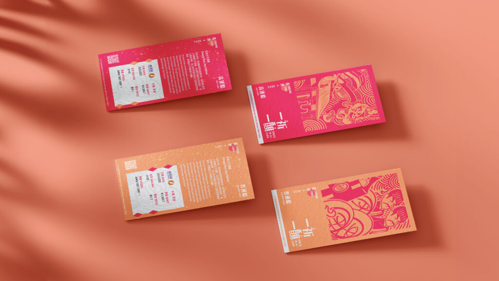
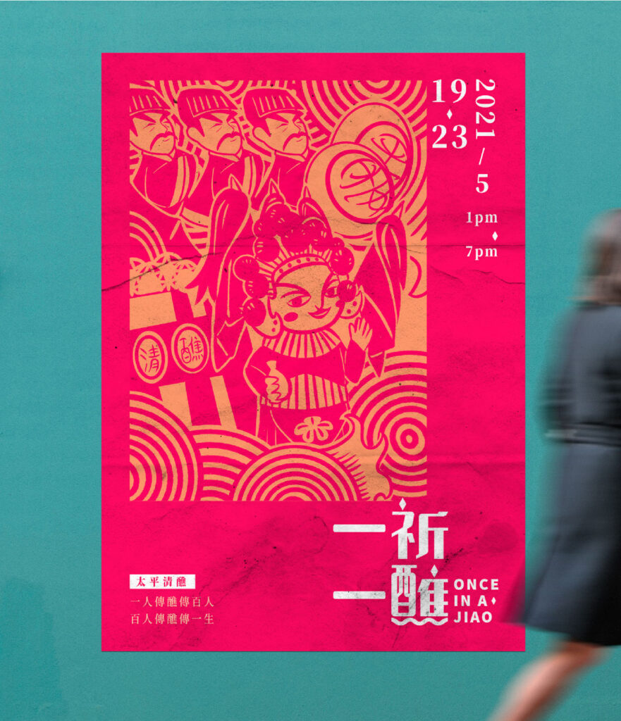
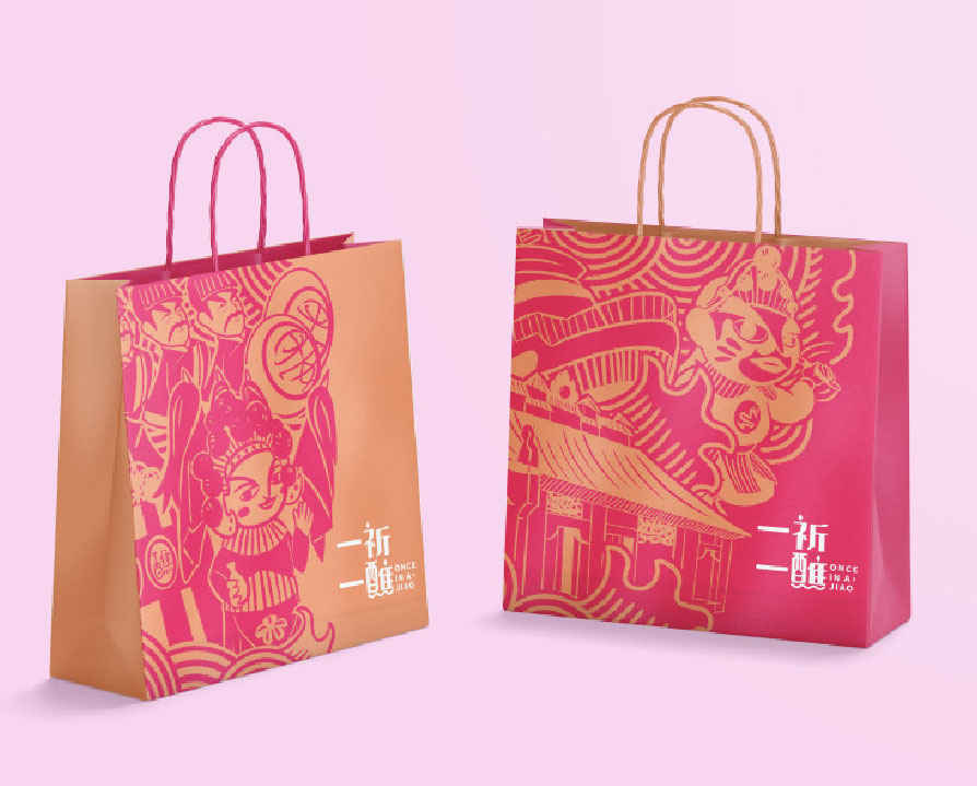
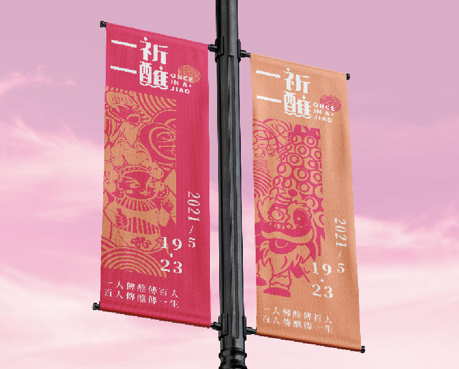
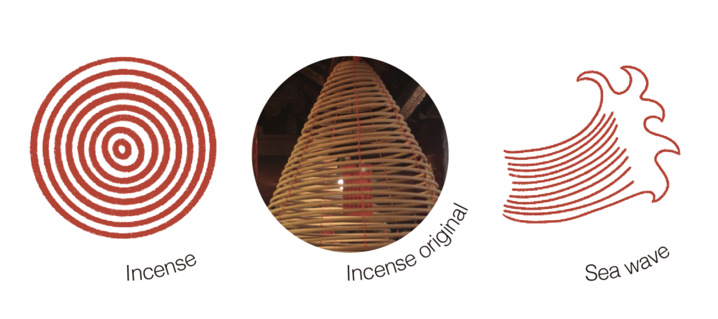
With the graphic, I have chosen to use the style of Chinese paper cutting as a reference, combined with a cute aesthetic. This creates a sense of tradition while also making the festival feel more youthful. Based on the research, there are three key elements that will serve as the super graphics for the brand:
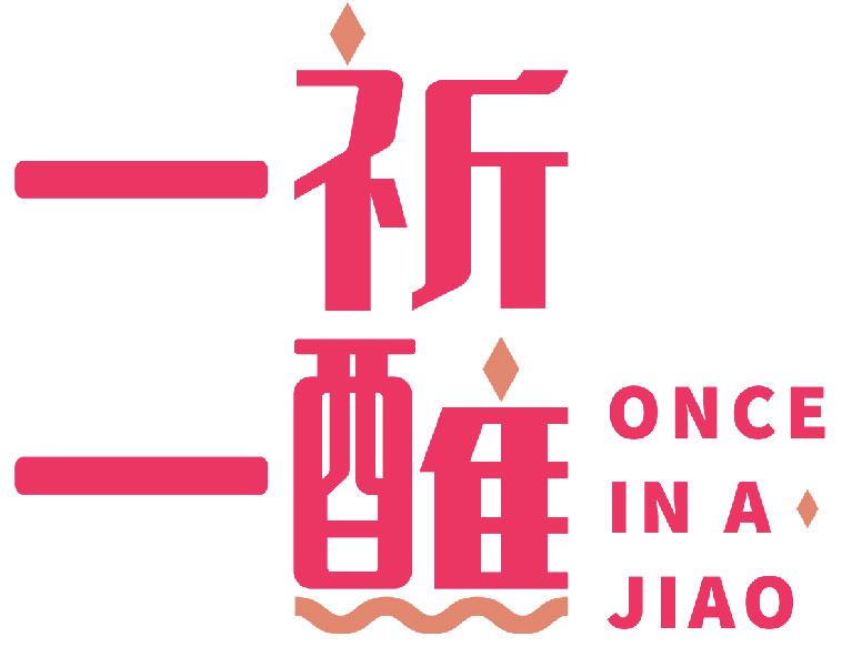
Logo design
Diamond shape represent the shape of the flower plague in the Da Jiao activities. Also sea waves helps to present Cheung Chau Da Jiao Festival are held in Cheung Chau, An island in Hong Kong.
